Insights
How to Create a Design System Step by Step (Complete Guide 2026)
Design plays a major role in the success of any digital product. But in recent years, the meaning of ‘design’ has changed radically, especially in the digital sector. Products need to add new features, grow, sometimes pivot — and do all of this very fast. Timelines have shrunk to unimaginable levels: what used to take months now needs to happen in weeks. The challenge is no longer just creating a beautiful, distinctive design — it’s making sure that design serves as a solid foundation for agile growth without losing consistency. That’s where a Design System comes in.

Contents
- What is a Design System?
- What are the benefits?
- How to design a Design System step by step
- How to publish a Design System
- Design Systems in 2026
- Frequently asked questions
What exactly is a Design System?
A Design System is essentially a collection of elements — buttons, headings, forms, tabs, carousels, tooltips — used to build a website as if assembling Lego bricks. It also brings together all the design rules that must be followed when using those ‘bricks’.
A Design System should not be confused with a style guide: what truly sets a Design System apart is that it is more than a reference document — it is a working tool. Some well-known examples include Material Design by Google and Carbon Design by IBM.
What are the benefits of a Design System?
The main goal of a Design System is to help a product grow quickly without losing the consistency it needs. But the benefits go further:
-
The design team works better because decision-making is reduced — all elements are predefined in the system. There are fewer debates and fewer personal interpretations from individual designers.
-
The development team works better because code can be reused easily.
-
Collaboration between designers, developers, and content managers is more effective because everyone understands the product better, uses the same terminology for each element, and knows its purpose.
-
Greater organisational flexibility is achieved: when teams grow or change, onboarding is faster because everything is more standardised.
-
Even a site with hundreds of pages feels more consistent and easier to use, because clear, recognisable patterns are established for users.
-
The site is easier to maintain, the code is optimised, and performance improves.
-
Everything teams need (design templates, documentation, code repositories, resources) is in one place.
-
Costs decrease.

So should every company have a Design System? Company size usually answers that question. Clearly, Design Systems are essential for organisations where many people work on the same product simultaneously — sometimes from different departments or even different countries. But they are also valuable for startups and smaller companies: even if a Design System seems less necessary at first, the development agility it provides will pay off as soon as the product and team begin to grow or change.
How to design a Design System?
To create a Design System step by step, you need a UI design tool to shape the various elements. We use Figma, which in 2026 is the industry standard. Sketch remains a valid alternative.

The creation process typically follows the Atomic Design methodology, proposed by American web designer Brad Frost, which has become one of the leading references in this field. You can find more information on his blog. In essence, it states that all elements of a website are structured in three levels he calls atoms, molecules, and organisms: atoms are the simplest pieces, meaningless on their own, but when combined they form more complex molecules, which in turn come together to build organisms. Most Design Systems follow this concept, though the levels are usually called foundations, components, and patterns.
1. Foundations
Also called design tokens or simply tokens, foundations are the smallest unit of a Design System (in Atomic Design terms, what Brad Frost would call ‘atoms’). In Figma, foundations take the form of styles that are later used when creating Design System components. The most common foundations are the grid, the colour palette, typography, iconography, and animations — though others can be added depending on the nature of the site.
The grid
‘Grid’, ‘layout’, ‘pattern’, ‘scaffold’ — these are all different terms for the same concept: the space the site occupies and how elements are distributed within it so users can find and understand content more easily. The grid must be consistent across every page of the site, as this helps create strong visual coherence. To define a grid, you need to specify:

-
Breakpoints: Space looks very different on a 360px mobile screen versus a 2500px Mac display — so the grid must adapt accordingly. The first thing to define in a Design System are the breakpoints that will set the different resolutions designers and developers must work with. You’ll typically have four grids: one for mobile, one for tablet, one for laptop, and one for desktop.
-
Base unit: This is the number that serves as the foundation for all sizes used across the site. The most common is a base-8 system, though other numbers are also used. All element dimensions must be a multiple of this number. Using 8 means available sizes are 8px, 16px, 24px, 32px, 40px, 48px… As an example, a button can be 32px or 40px tall, but never 36px. Some designers prefer a base of 6 or 5 for finer granularity.
-
Container and columns: The grid divides into columns. Large breakpoints typically use 12 columns — a versatile number because it’s divisible by 2, 3, 4, and 6. Smaller breakpoints use fewer: 8 for tablets and 4 for mobile. The sum of all columns is called the ‘container’.
-
Margins: The container never extends to the screen edges — it always leaves space on both sides. On small screens, containers are usually fluid with fixed narrow margins. On large screens, a maximum width is set (980, 1080, 1140, 1200px…) and the margins are the remaining space.
-
Gutters: Columns are separated by spaces called gutters. As with everything else, gutter widths must be multiples of the base unit. Gutters typically vary by breakpoint: wider on large screens (24px with a base-8 system), narrower on small screens (16px).
-
Rows: Where columns organise content horizontally, rows do so vertically. Horizontal lines spaced exactly one base unit apart create a grid into which every element in the Design System must fit.
-
Spacing: Some Design Systems treat spacing as separate from the grid, though we think they’re closely related. Spacing defines the set of values that can be applied between interface elements. Again, the base unit generates all these values. Typically around 13 spacing values are used, by multiplying the base unit by 0.25, 0.5, 1, 1.5, 2, 3, 4, 5, 6, 8, 10, 12, and 20.
The colour palette
Every Design System must include a list of the colours that can be used across the site, along with the role each one plays. This is crucial: colour is one of the most recognisable elements of any site and one of the biggest contributors to visual consistency. More than decoration, colour is a language of its own and a powerful way to communicate effectively with users.
All colours must work well together, and above all they must provide adequate contrast when placed alongside each other — especially text colour against backgrounds. We recommend achieving at least AA contrast according to WCAG (Web Content Accessibility Guidelines). Useful tools for checking this include Color Contrast and Colorable.

To improve site consistency, use as few colours as possible. We’ve previously written about how to choose a colour palette for a website, so here’s a quick summary:
-
The brand colour is the colour that represents the company — the dominant colour in the site. Also called the primary colour, it’s the reference point for generating the rest of the palette.
-
The accent colour is usually a vivid, eye-catching colour that contrasts well with the brand colour. Its function is to draw users’ attention to strategic elements such as buttons, links, or key text.
-
Maintaining a site with only brand colours is rarely practical, so it’s common to share the primary role across two or three additional colours, always with a clear hierarchy. These are called secondary colours.
-
The palette should also include neutral colours for the site’s architecture — backgrounds, borders, and body text. These are typically white, black, and mid-range greys. Note that pure black (#000000) and pure white (#FFFFFF) create a very high contrast that can cause visual fatigue — we recommend softer alternatives (#FFFEFC and #212121, for example). Tools like PALX can help you generate harmonious neutrals.
-
Finally, a Design System needs functional colours to represent states and actions: errors (typically red), warnings (yellow), confirmations (green), information (blue), and help (purple). These should be harmonised with the rest of the palette.
Once all colours are selected, create lightness variations for each one. Working with HSL colour models (hue, saturation, lightness) makes this much easier. Typically four variations are included per colour (dark, main, light, and faded), but use as many as needed. These variations are useful for hover effects, gradients, and disabled states.

Typography
Like colour, typography is one of the elements that most defines the final appearance of a website. It’s essential to document all its characteristics in the Design System: typeface, variants, size, line height, letter spacing…
-
Typeface: Typically two typefaces are chosen: one with personality that represents the brand (used for selected headings) and one chosen for legibility (used for dense body text). Ideally they contrast clearly with each other — for example, a serif paired with a sans-serif. We’ve shared some tips for improving web typography legibility on this blog.
-
Variants: Once all permitted typefaces are established, provide guidelines on valid font weights: thin, light, regular, medium, semibold, bold, extrabold, black… Italic usage should also be defined.
-
Scale: Font sizes serve a critical usability function: establishing information hierarchy. Using too many sizes creates visual disorder. The ideal is a limited number of sizes in a proportional relationship — a typographic scale. Eight sizes is a good target: five for short text (headings, labels) and three for dense text (body copy). All sizes should be derived from the base unit multiplied by a scale factor. A common approach is a 16px base (8×2) multiplied by 0.64, 0.8, 1, 1.25, 1.563, 1.953, 2.441, and 3.052, giving: 10.24px, 12.80px, 16px, 20px, 25px, 31.25px, 39px, and 48.83px. Explore more scale options at Type Scale. These sizes apply to desktop; mobile screens are read at closer range, so font sizes should be reduced.

-
Line height: Font sizes and line heights should align with the grid to allow better pairing of text and other interface elements.
-
Tracking: It’s advisable to optimise letter spacing (tracking), especially at large sizes for short text — slightly tighter tracking avoids unnecessary line breaks and creates more harmonious compositions. Conversely, leave tracking untouched for dense body text.
Icons
Most websites use icons, which are highly effective in user interfaces because they can explain a concept at a glance.
To avoid improvisation, the Design System should provide a comprehensive icon set. All icons must share visual similarities that make them feel like a family: style, stroke width, colour, fill… A useful naming convention is to name icons by what they represent rather than what they are. For example, the trash icon should be called ‘delete’, so that every time this action needs to be shown, the same icon is used — not a cross or an X. This improves consistency and makes the experience more intuitive.

Icons must fit within a bounding box whose dimensions are multiples of the base unit so they align with the site’s grid. Since icons often need to work at very small sizes (24×24px is common with a base-8 system), they must be designed to remain legible at that scale.
Motion
Motion is an important point. The way and speed at which objects move on a site — whether a modal window, carousel items, or a button hover — contributes to the sense of consistency. The Design System must specify motion behaviour.
Other elements
As mentioned, a Design System may include additional foundations depending on the site’s nature — elevations, gradients, and so on. If the site won’t use shadows or gradients, there’s no need to define them.
2. Components
With foundations defined, the next step is to create components. Components are small, indivisible pieces that serve as the primary building blocks for user interfaces.
Start by making an inventory of all the ‘pieces’ you’ll need for the site. The Design System should include only the components that will actually be used. In this article we’ll cover the most common ones — links, buttons, inputs, checkboxes, modals, tables, and tabs — but many more are possible: avatars, badges, charts, tags, switches, sliders, lightboxes, spinners, skeleton screens… As we’ll see, Design Systems are open, ever-evolving documents.
Once the inventory is ready, each component is drawn in Figma.
Links
Links are essentially just text, but they must have an appearance that helps users identify them easily. A link can have four states — link (default), visited, hover, and active — all of which must be defined in the Design System.
Some Design Systems also differentiate between internal links (within the site) and external links (to other sites), typically using an icon alongside the link text.
Buttons
Buttons are one of the most essential components in a Design System, as they have become a primary point of interaction between users and interfaces.
A Design System typically includes button variants to allow multiple buttons on the same screen without creating confusion about which to click. Generally two types are defined: one for primary actions and one for secondary. Buttons also come in different sizes depending on where they appear — standard and small are the most common.
For each button, the Design System must define states: enabled (default, indicating the button is operational), hover (reinforcing interactivity when the cursor passes over it), active (when clicked), and disabled (when the button is unavailable). A loading state may also be included for when clicking a button triggers a process the user must wait for.
Buttons sometimes include icons to help clarify their purpose.
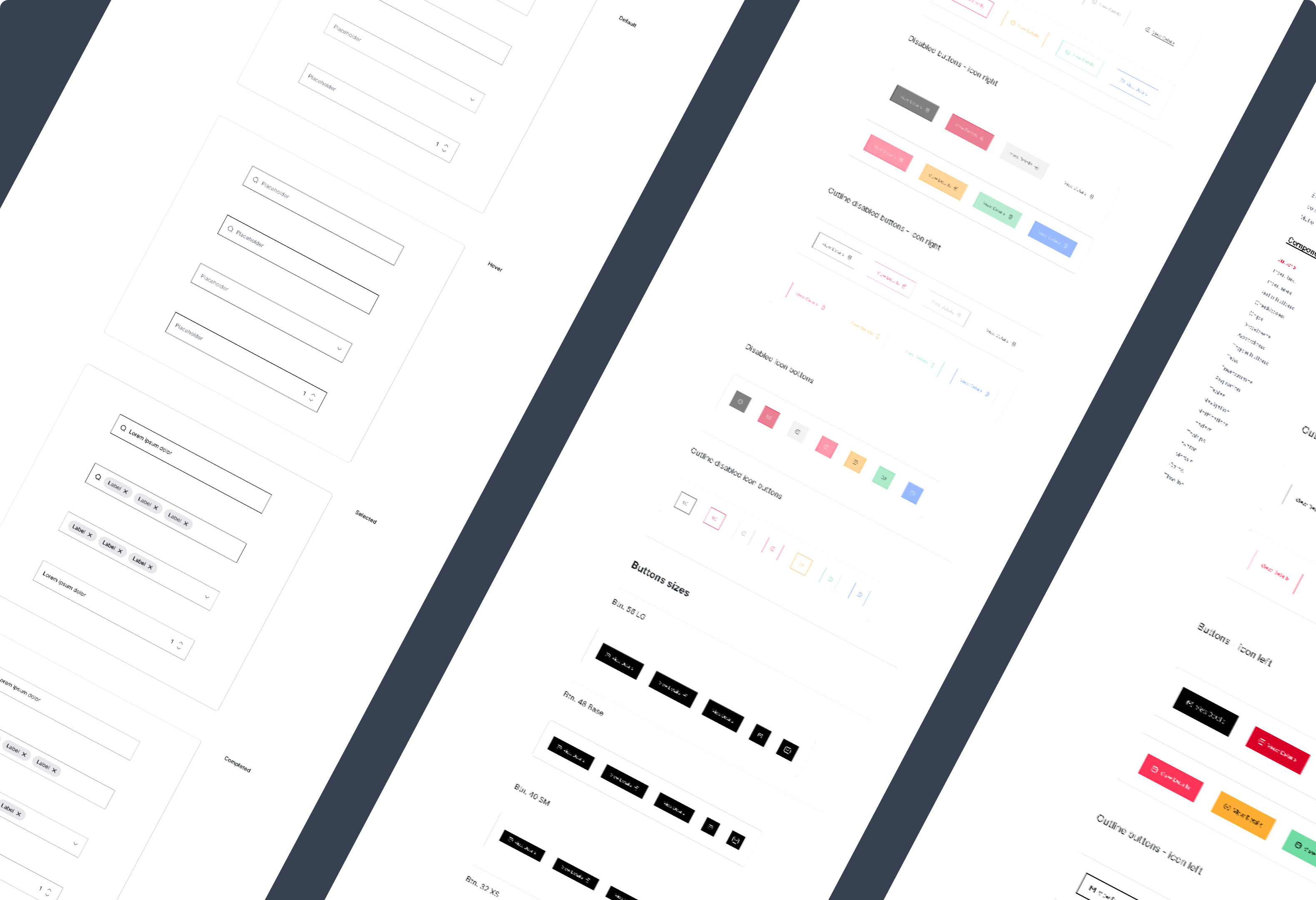
Inputs
Like buttons, form fields (inputs) are another heavily used interactive element. They come in several types — text, textarea, dropdown — but all share common visual characteristics the Design System must define: labels, placeholders, and so on. Labels and placeholders serve different purposes. The most common pattern is a label above the field and placeholder text inside when empty. An increasingly popular alternative is to have the label inside the field when empty and transition above it when the field is focused or filled — while the placeholder appears beneath the field.
Input states must also be defined:
- Active: Default state. The field is ready to receive input but hasn’t been touched.
- Hover: The appearance when the cursor is over the field.
- Focus: After the user has clicked the field. Indicates the field is being edited.
- Filled: When the field has a value and is no longer focused.
- Disabled: Prevents interaction until some prerequisite is met. Typically shown in muted colours.
- Error: Shown when the input value is invalid. Apply the error colour (typically a red) plus an explanatory message and optionally an icon.
- Success: Not all forms include this, but when real-time validation is used (validating on blur rather than on submit), this state confirms the input value is valid. Commonly used for phone numbers or credit card fields. Apply the confirmation colour (green) and an icon.
Checkboxes and radio buttons
Checkboxes and radio buttons are quite similar. Both are used to select options, with one key difference: checkboxes allow multiple selections, while radio buttons work as a group where options are mutually exclusive — selecting one automatically deselects the others.
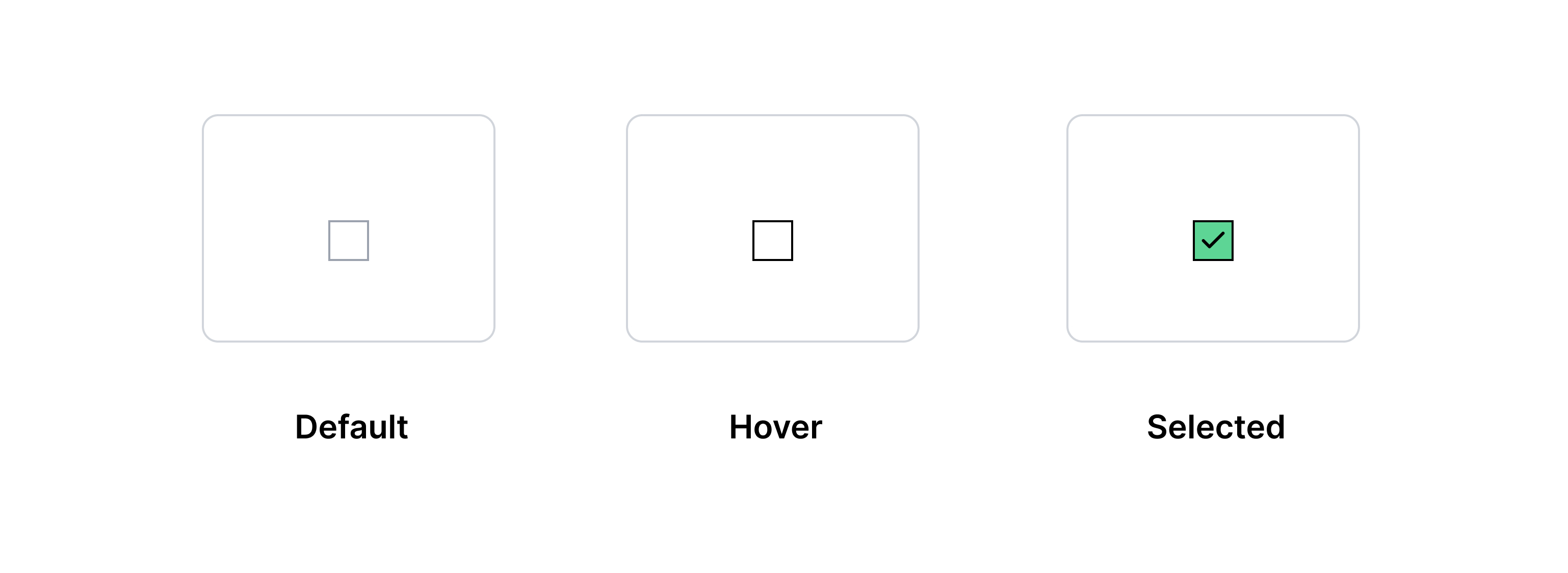
Traditionally, checkboxes use a square indicator and radio buttons a circular one. It’s best to keep this convention to avoid confusing users.
States for both must be defined: active (default, same as unchecked), hover, checked, disabled, and error.
Modals
Modals are windows that appear in front of the main content (typically centred on screen) and interrupt the user flow, requiring a response before continuing. They must always include an action element or at minimum a close button.
While modals can be thought of as empty containers that can hold any type of content, they need a well-defined structure in the Design System to ensure a consistent experience: the same appearance, the same animation, and the same way of ‘locking’ the site. Action elements must also always be in the same position.
Alerts (or banners)
Banners display pop-up messages. The Design System must differentiate each banner’s appearance based on the type of message it conveys — both through background colour (as covered in the colour section: red for errors, yellow for warnings, green for confirmations, blue for information) and through accompanying icons or imagery. Banners don’t interrupt the user flow but should provide a way to react — either by dismissing them or through more complete actions represented by buttons.

Tooltips and toasts
Tooltips display additional information when hovering over an element. Similar to tooltips, toasts (also called snackbars) are small, brief pop-up messages that appear quickly (typically at the bottom of the screen) after an action is performed — for example, when copying text via a button. Unlike modals, toasts don’t block the screen; unlike banners, they disappear on their own without requiring user action.
Cards
Cards are used to group related information and are one of the most widely used components on any site. They can take many forms, but consistent structure is always important. Cards are usually interactive, so they typically include buttons (usually at the bottom), though sometimes the entire card acts as a button.
Carousels
When many cards are needed, they are often grouped in carousels — a collection of items arranged for horizontal scrolling that makes better use of space by reducing the need to scroll vertically. Carousels need navigation controls. On touch devices these are often hidden so users can use native swipe gestures.

Tables
Tables organise data in rows and columns in a way that is easier to read and access. The Design System must define the appearance and usage of each table type, as well as each of its parts: header, body, footer…
Lists and indexes
Lists can be used in many contexts, from body text to navigation (table of contents). The visual element that distinguishes them is the bullet that precedes each item.
Accordions
Accordions are very useful when a large amount of structured content needs to be presented without taking up too much space. A portion of the content (typically the heading) is visible while the rest is hidden. They’re commonly used for FAQ pages. Their most recognisable feature is an icon next to each heading that changes depending on whether the content block is expanded or collapsed — for example ‘+’ to show more and ‘−’ to hide.
Tabs
Tabs organise a page like a filing cabinet, displaying different content depending on which tab is active. There must be a clear visual distinction between selected and unselected tabs.
Pagination
Like tabs, pagination controls reveal different content depending on the number the user selects. Pagination is used almost exclusively for item listings — blog posts, shop products — to avoid excessively long scroll.

Breadcrumbs
Breadcrumbs are a navigation element that tells users their current location within the site structure and shows a path from the current page back to the homepage through all parent pages. Displayed at the top of the page — typically just below the main navigation — they’re especially useful on deep sites. A deeply nested page often contains highly specific content, so if a user arrives via a Google search, breadcrumbs let them navigate ‘up’ to more general content.
On mobile, however, breadcrumbs often cause more problems than they solve — they tend to wrap over multiple lines, occupying valuable space at the top of the screen without clearly illustrating the hierarchy. In these cases, a single-element breadcrumb pointing to the parent level is usually the best solution.
3. Patterns
With the site’s components defined, the next step is to build patterns (some Design Systems call them templates; at our studio we prefer the term modules). These modules are small ecosystems in which different components coexist to create a specific functionality.
Predefining types of modules makes page creation much easier. Beyond the common parts — headers and footers — that help unify the site as a whole, we usually return to the same design solutions when integrating content. Not only is the design and development of new pages faster this way, it also produces a more consistent user experience through recognisable patterns.
How to publish a Design System?
Once all Design System elements have been designed, it’s time to publish it. Design Systems are not static documents. They grow and evolve constantly — so PDFs and other static formats are not well suited for publishing them. If you use PDFs, every change requires publishing a new version and notifying the entire team. There’s no guarantee everyone will be aligned, as multiple different versions may circulate simultaneously across different teams, causing confusion.
The recommended approach is to publish the Design System as a website, where everyone involved in designing and developing the site can not only resolve questions but also directly access all resources, components, and patterns. It becomes a living working environment: a designer can prototype a page quickly using Figma components, a developer can copy the code they need, a marketing team member can check style guidelines for their creatives, and a copywriter can review tone of voice rules.
This site can be divided into three main sections: branding, library, and resources.

1. Branding
As we’ve seen, a Design System is not a brand manual — but every Design System must include brand manual content. This first section gathers information that, while not strictly related to site design and development, plays an important role in defining other Design System elements. We include the logotype, brand values, buyer persona, and content guidelines.
The logotype
The logotype is perhaps the element that best represents a brand, so it needs careful attention. The Design System should make it easy to download all approved versions of the logo — both the canonical version (how it should appear by default) and alternatives (such as the monochrome version), with clear guidance on when to use each. Always include all resolutions and formats (JPEG, PNG, SVG). This prevents anyone from creating their own unofficial version that might inadvertently alter the logo’s characteristics.
The Design System should also address every situation in which the logo might appear: all permitted sizes (following the base unit), placement rules, and clear margins. The logo must work and be recognisable at every size, so a simplified version for small uses like the favicon is a good idea.
Brand values
A brand is much more than a logo. It’s a set of values that define a company’s identity and drive every decision made within it — from launching a new product to running a campaign to shaping workplace culture.
Including a manifesto in the Design System is important because it helps guide design decisions and content direction. Users increasingly value brands that share their worldview. Document the brand’s principles, what it does, why it does it, and what it aims to achieve — what’s traditionally called the company’s ‘mission’ and ‘vision’.
Buyer persona
Understanding your customers is essential, but keeping them at the centre of every decision is what drives success. A Design System is the ideal place to publish a buyer persona, as it’s a document every designer needs accessible at all times when proposing navigation solutions. If you don’t yet have a buyer persona — or aren’t sure what one is — we recommend reading our post on how to create one for your business.
Content
No matter how visually consistent your design is, the user experience won’t be complete unless the content is too — both written and visual. The Design System needs to establish writing guidelines that produce a consistent, recognisable voice: appropriate for the audience, aligned with the design, and clearly expressing the brand personality.
It’s also useful to include a glossary of standard taglines and phrases, plus typography and editorial rules that standardise the use of capitals, italics, bold, and punctuation. All of this will help copywriters do their best work.
On the web, language isn’t just written — visual language carries equal weight. Photos, videos, illustrations, and patterns communicate as powerfully as words. Including in the Design System the requirements for all visual material uploaded to the site — both style requirements and technical ones (for example, recommending WebP and AVIF image formats or specifying filters that should be applied before publication) — alongside a link to an image repository where designers can access a pre-approved selection can be very useful.
2. The library
The library is the translation into code of the token, component, and module inventory created in the design tool. This library is the actual working framework for web developers. Each element includes:
-
Name: Whether a variable, component, or module, the library specifies the name of each element using the same nomenclature established during the design phase. This eliminates miscommunication: everyone involved in the site (designers, developers, content managers) knows exactly what is meant when referring to, say, an ‘accordion’.
-
Description: Each element comes with a description of its function and usage guidelines — how it should be used and in which situations. Sometimes examples of dos and don’ts are included to provide context.
-
Code: Each element includes a sample code snippet that developers can copy and paste into their project, then adapt by adjusting the specified attributes and classes.
3. Resources
Finally, the Design System can include all the tools designers and developers need:

-
Applications: Links to the various tools (Figma, Sketch, Photoshop, Illustrator, Visual Studio Code, Zed…) and any required plugins. A list of useful online tools can also be included.
-
Downloadable templates: Primarily design templates (Figma, Sketch) ready-made with all components, styles, and guides for creating new screens, plus templates for image creation or content writing.
-
Version control: If working with continuous integration, it’s useful to include the workflow and access to the repositories here.
Design Systems in 2026
When this article was first published, Design Systems were already an established practice in large product teams. Four years on, the field has evolved significantly. Two trends now dominate the landscape: the consolidation of design tokens as a formal standard, and the emergence of artificial intelligence as a regular part of the workflow.
Design tokens: from concept to W3C standard
In the foundations section we introduced tokens as another name for the smallest units of a Design System. Since then, they’ve moved from an informal term to an official standard: the W3C Design Tokens Community Group has published a specification that defines how these values should be structured and shared between tools.
This means it’s now possible to define all Design System values — colours, typography, spacing, border radii, shadows — in a standardised JSON file that design tools, component libraries, and CSS preprocessors can consume directly. The result is a single source of truth that eliminates duplication between Figma and code.
Figma Variables: real synchrony between design and code
In 2023, Figma launched Variables — and by 2026 they’ve become the primary tool for managing design tokens within Figma. Unlike the original Figma Styles — which only allowed defining colours, typography, and effects — Variables let you store any type of value: numbers, strings, booleans, and colours. Most importantly, they support modes.
A mode in Figma Variables is equivalent to a theme: you can define a collection of colour variables with a ‘Light’ mode and a ‘Dark’ mode, or a spacing collection with ‘Compact’ and ‘Comfortable’ modes. Switching modes on any frame in the project is instantaneous, making multi-brand or multi-theme design radically simpler than before.
To keep Figma Variables and project code in sync, plugins like Tokens Studio export variables to a token file compatible with Style Dictionary or the W3C specification, which in turn generates the CSS custom properties or Sass variables that developers use. It’s the closest we’ve ever had to a real integration between design and code.
Storybook as a shared meeting point
If Figma is the designer’s tool, Storybook is the developer’s. It has evolved into the place where components are documented, visually tested, and shared between teams.
The integration between Figma and Storybook has deepened thanks to plugins and addons that let you view the Figma component and its code counterpart side by side. This reduces handoff friction and makes it easier for designers and developers to share the same vocabulary — which is, ultimately, one of the primary goals of any Design System.
At The Interactive Studio we use Storybook to document the components of the Design Systems we build for our clients. Each component includes its variants, props, states, and real-world usage examples. It’s a living resource the development team uses daily — not a PDF that goes stale.
AI as an acceleration tool
Artificial intelligence has entered the Design System workflow primarily as an accelerator, not as a replacement for design judgement. Here are some concrete uses we already see in real projects.
Automatic documentation generation: AI-powered tools can generate usage descriptions for each component based on the component itself and its props, saving a significant amount of the most tedious documentation work.
Token suggestions: Some Figma plugins analyse an existing design and identify repeating values — colours, spacing, typography — to propose a coherent token structure. This is especially useful when starting a Design System from a legacy project with no existing tokens.
Consistency review: By analysing the complete design, these tools detect components that don’t respect the defined tokens, acting as a visual linter for the Design System.
What hasn’t changed — and probably won’t — is that a good Design System still requires grounded design decisions: what to include, how to name it, what level of abstraction to apply to each token. AI can help with execution, but the strategy remains human work.
Frequently asked questions
What’s the difference between a Design System and a style guide?
A style guide is a reference document: it explains how a brand’s visual elements should be used. A Design System goes further because it’s a working tool: it includes components in real, usable code that developers can use directly, documentation for each element, usage criteria, and everything needed to build and scale the product.
How long does it take to create a Design System from scratch?
It depends on the product’s scale. For a medium-complexity website, building a functional Design System — with foundations, the most common components, and basic documentation — typically takes two to four months. The first months are the most intensive; from there the system grows incrementally as the product evolves.
Is Figma required to create a Design System?
No, though in 2026 Figma is the most widely used tool in the industry. Sketch remains a valid option. What matters is not the design tool itself, but whether the design side and the code side share the same source of truth — ideally through synchronised design tokens.
How do you keep a Design System up to date?
A Design System needs at least one person responsible for its maintenance. The most common approach is to designate a design system maintainer role to manage requests for new components, review whether existing ones are still relevant, and communicate changes to the team. Without that role, the system tends to go stale quickly — and with it, loses much of its value.
With a Design System, any digital product — whether a website or an app — can grow in an agile way without the loss of consistency that often comes with rushed changes. If you need to build your own Design System, at The Interactive Studio we can help you create one.
Related articles
If you want to go deeper into the building blocks of a Design System, these three articles connect design, content, and implementation:


Need help with your Design System?
We design and build robust systems for digital products, from foundations and components to documentation and implementation support.
Explore servicesDid you find this post interesting? Share it!
Your contacts will like to read it, for sure!


